Conservation Features + Demographic Data
Overview
The following section provides an example of a possible workflow using demographic connectivity data as a conservation feature in Marxan. It is important to note that these are indeed examples of the software’s capabilities and are not intended to be used as scientific advice in a spatial conservation planning process.
The maps and plots shown in this tutorial were created in R using the shapefile exported from the “Plotting Options” tab of Marxan Connect. The R code used to make the plots can be revealed by clicking on the Code button below
library(sf)
library(leaflet)
library(tmap)
library(tidyverse)
library(DT)
# set default projection for leaflet
proj <- "+proj=merc +a=6378137 +b=6378137 +lat_ts=0.0 +lon_0=0.0 +x_0=0.0 +y_0=0 +k=1.0 +units=m +nadgrids=@null +wktext +no_defs"Case Study
In this case study, we will be working with data from the Great Barrier Reef in Australia. Our represenation features consist of a subset of bioregions identified by the Great Barrier Reef Marine Park Authority and the connectivity input data consists of calculated probabilities from the spatial distribution of reefs and estimated biological parameters.
Input Data
Download the example project folder. This folder contains the Marxan Connect Project file, input data, and output data for this example.
Before opening Marxan Connect, let’s manually look through the Marxan database to view the standard set of input files (spec.dat, puvspr.dat, bound.dat, and pu.dat) in the input folder of the CF_demographic folder.
The planning unit file (hex_planning_units.shp) includes 653 hexagonal planning units that cover the Great Barrier Reef.
spec.dat
spec <- read.csv("tutorial/CF_demographic/input/spec.dat")
datatable(spec,rownames = FALSE, options = list(searching = FALSE))puvspr.dat
The table shown here is a trimmed version showing the first 30 rows as an example of the type of data in the puvspr.dat file. The original dataset has 974 entries.
puvspr <- read.csv("tutorial/CF_demographic/input/puvspr.dat")
datatable(puvspr[1:30,],rownames = FALSE, options = list(searching = FALSE))bound.dat
The table shown here is a trimmed version showing the first 30 rows as an example of the type of data in the bound.dat file. The original dataset has 3600 entries.
bound <- read.csv("tutorial/CF_demographic/input/bound.dat")
datatable(bound[1:30,],rownames = FALSE, options = list(searching = FALSE))pu.dat
The table shown here is a trimmed version showing the first 30 rows as an example of the type of data in the pu.dat file. The original dataset has 653 entries.
pu <- read.csv("tutorial/CF_demographic/input/pu.dat")
datatable(pu[1:30,],rownames = FALSE, options = list(searching = FALSE))Conservation Features
This map shows the bioregions, which serve as conservation features in the Marxan analysis with no connectivity.
puvspr_wide <- puvspr %>%
left_join(select(spec,"id","name"),
by=c("species"="id")) %>%
select(-species) %>%
spread(key="name",value="amount")
# planning units with output
output <- read.csv("tutorial/CF_demographic/output/pu_no_connect.csv") %>%
mutate(geometry=st_as_sfc(geometry,"+proj=longlat +datum=WGS84"),
best_solution = as.logical(best_solution)) %>%
st_as_sf()map <- leaflet(output) %>%
addTiles()
groups <- names(select(output,-best_solution,-select_freq,-google_demo_pu_discrete_median_to_maximum,-google_demo_pu,-status))[c(-1,-2)]
groups <- groups[groups!="geometry"]
for(i in groups){
z <- unlist(data.frame(output)[i])
if(is.numeric(z)){
pal <- colorBin("YlOrRd", domain = z)
}else{
pal <- colorFactor("YlOrRd", domain = z)
}
map = map %>%
addPolygons(fillColor = ~pal(z),
fillOpacity = 0.6,
weight=0.5,
color="white",
group=i,
label = as.character(z)) %>%
addLegend(pal = pal,
values = z,
title = i,
group = i,
position="bottomleft")
}
map <- map %>%
addLayersControl(overlayGroups = groups,
options = layersControlOptions(collapsed = FALSE))
for(i in groups){
map <- map %>% hideGroup(i)
}
map %>%
showGroup("BIORE_102")Connectivity data
The connectivity data is at the ‘heart’ of Marxan Connect’s functionality. It allows the generation of new conservation features and/or spatial dependencies to be characterized and included based on connectivity metrics. Let’s examine the spatial layers we’ve added in order to incorporate connectivity into this Marxan analysis. Marxan Connect needs a shapefile for the planning units, and optionally focus areas and avoidance areas. For simplicity, we have not included focus or avoidance areas in this tutorial. These spatial layers are shown in the map below.
# planning units
pu <- st_read("tutorial/CF_demographic/hex_planning_units.shp") %>%
st_transform(proj)p <- qtm(pu,fill = '#7570b3')
tmap_leaflet(p) %>%
addLegend(position = "topright",
labels = c("Planning Units"),
colors = c("#7570b3"),
title = "Layers")hexflow.csv
The connectivity data for this analysis can be found in the hexFlow.csv file in the CF_demographic folder. For this example, we have created the connectivity matrix for you. This data was simulated solely for the purpose of this tutorial and should not be used for other purposes. For more information on what this data represents, see ‘Connectivity Input’. We note, however, that for demographic connectivity analyses, this file should be created ahead of the Marxan Connect workflow and should best reflect the demographic connectivity goals of the user (e.g. dispersal models, movement data). For landscape connectivity data, Marxan Connect does have some functionality to create connectivity matrices from resistance data (see landscape connectivity tutorial).
For the sake of your web browser, this table only contains the 7 rows and columns of the connectivity matrix. The real file is a 653 X 653 matrix.
conmat <- read.csv("tutorial/CF_demographic/hexFlow.csv",check.names = FALSE)[1:7,1:7]
datatable(conmat,rownames = FALSE, options = list(searching = FALSE))Marxan Connect
Loading your project in Marxan Connect
Now that we have explored the input files, we are ready to open Marxan Connect and load our project. Please load the tutorial.MarCon file in the CF_demographic folder into Marxan Connect. You should not have to change any inputs in the project, but it is important to understand what these choices entail.
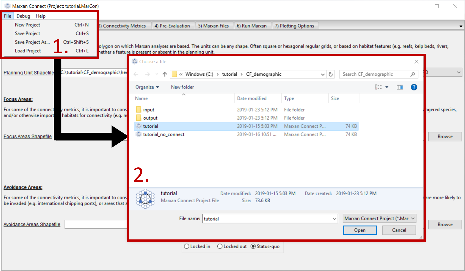
Figure 1: Loading Marxan Connect tutorial .
We will now step through the Marxan Connect workflow following the work flow tabs.
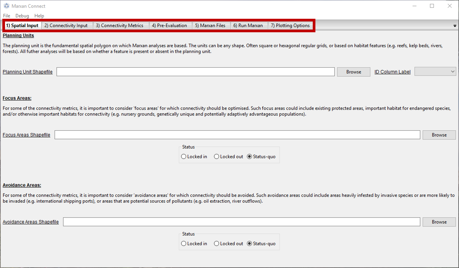
Figure 2: Workflow tabs .
Spatial Input
After loading tutorial.MarCon your Spatial Input tab should now look something like this:
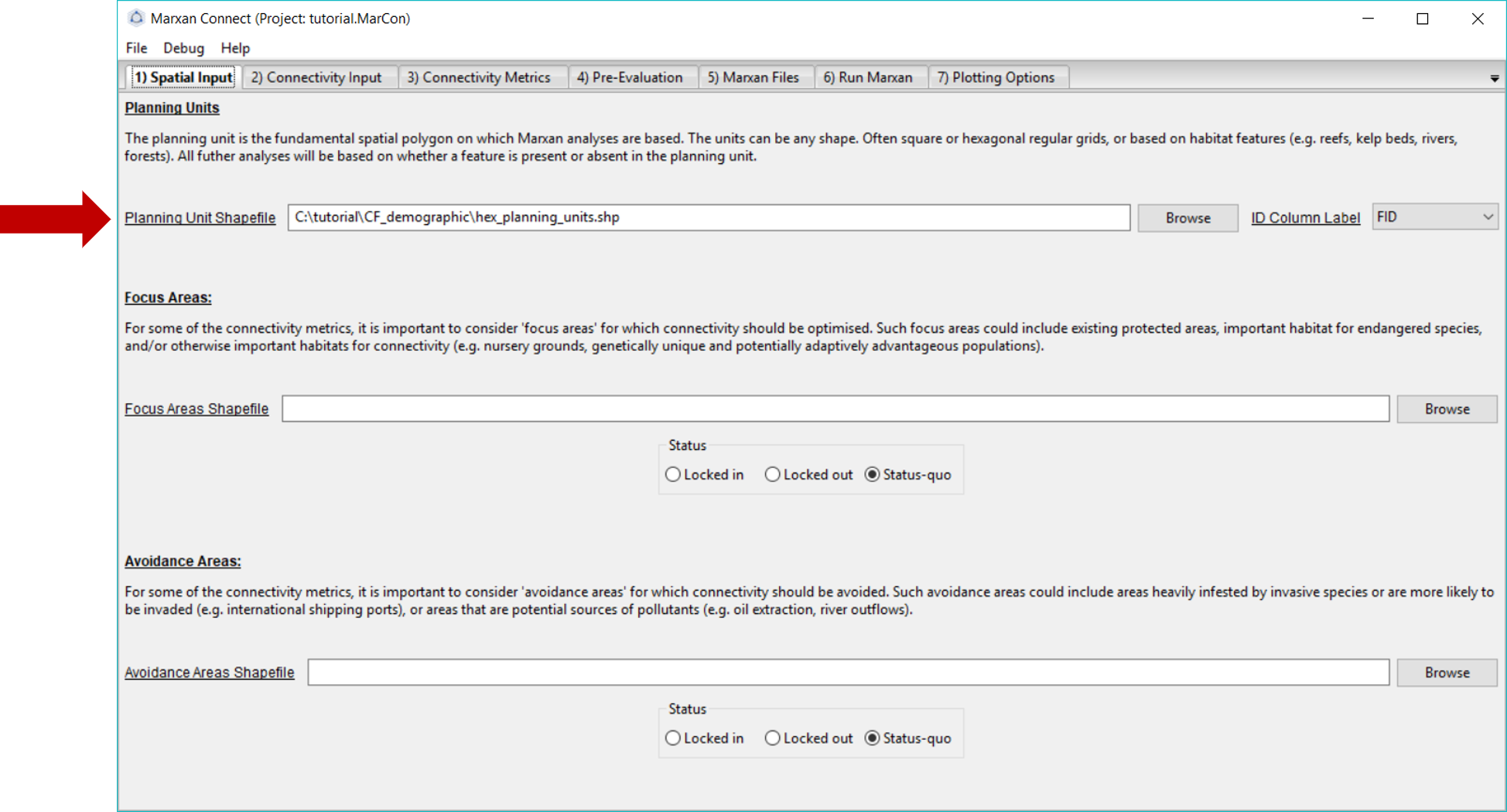
Figure 3: Spatial Input tab .
Make sure that the Planning Unit Shapefile and when relevant, the, Focus Area Shapefile and Avoidance Area Shapefile correspond to the appropriate input files (the Focus and Avoidance areas are not used in this example). On this tab, you can also choose whether the Focus Area Shapefile and Avoidance Areas Shapefile should be locked in, locked out, or status-quo (i.e. the planning unit status stays the same as what is designated in the pu.dat file).
Now we are ready to proceed to the Connectivity Input tab.
Connectivity Input
Since we are working with demographic data, we choose the Demographic Input option from the Choose Connectivity Input Category dropdown menu. Alternatively, Landscape Input could be chosen (see landscape connectivity tutorial).
On this tab, ensure that the Connectivity Matrix refers to the correct file. For this example, this should read hexFlow.csv. Since this data represents the amount of movement between planning units (i.e. number of larvae) in a matrix format (i.e. a flow matrix), we have selected the Flow Connectivity Matrix Type and the Matrix Format.
Additionally, we have chosen the Identical Grids option from the Rescale Connectivity Matrix menu. This signifies that our connectivity data is on an identical grid as our planning units. If our connectivity data was not on the same grid as our planning units, we could choose to rescale the connectivity matrix, which essentially does a spatial averaging routine to calculate connectivity on the planning unit grid. However, rescaling connectivity data requires assumptions (e.g. Beger et al. (2015); Beger et al. (2014)), and can be problematic (i.e. does the rescaled data accurately represent the connectivity process and spatial context of interest?). To avoid making inappropriate assumptions (e.g. resolution, neighborhood size, extrapolation), it is preferable and more appropriate to collect or generate the connectivity data at the resolution of the planning units. If rescaling is chosen, the user needs to decide whether to rescale the connectivity data proportional to the overlap or to assume homogeneous connectivity. For example, if a planning unit has a 50% overlap with connectivity data (i.e. half of the planning unit has connectivity data, and the other half does not), and the connectivity value is 10, does the user want the connectivity value to be taken from a spatial average across that planning unit (i.e. the connectivity value of that planning unit would then be 5) or be considered homogenous across the planning unit (i.e. a connectivity value of 10).
Your Connectivity Input tab should look like this (you should not have to change any settings if you loaded the .MarCon project):
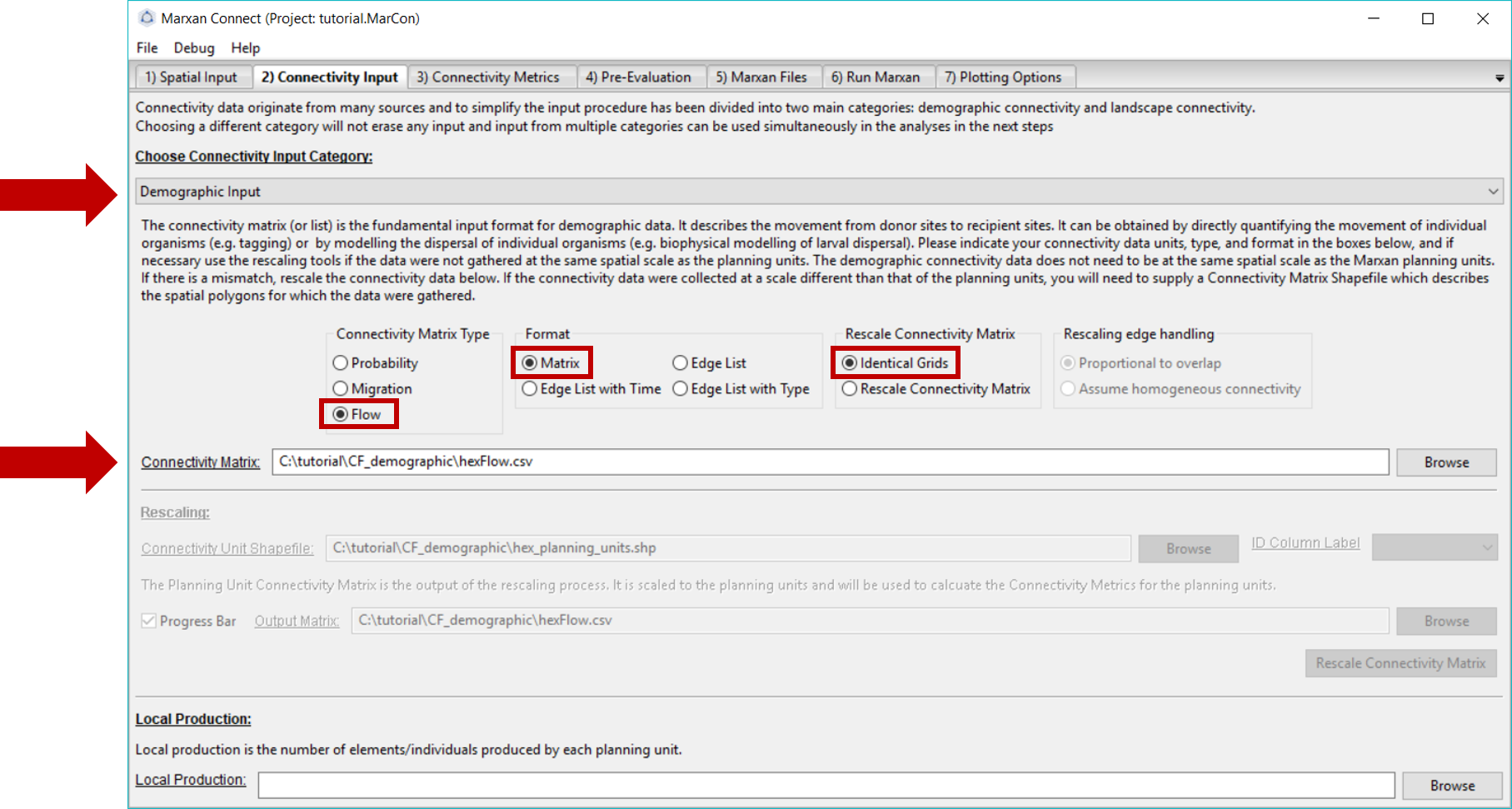
Figure 4: Connectivity Input Tab .
Now proceed to the Connectivity Metrics tab.
Connectivity Metrics
In this example, we have chosen to use the Google PageRank metric to create our connectivity-based conservation feature. However, there are a variety of metrics to choose from. We encourage you to scroll through the drop down menu in the top right corner for definitions, possible objectives and the mathematical formulations for different connectivity-based conservation feature options. We will ignore the Planning Unit Dependency as Boundary Definition in this example.
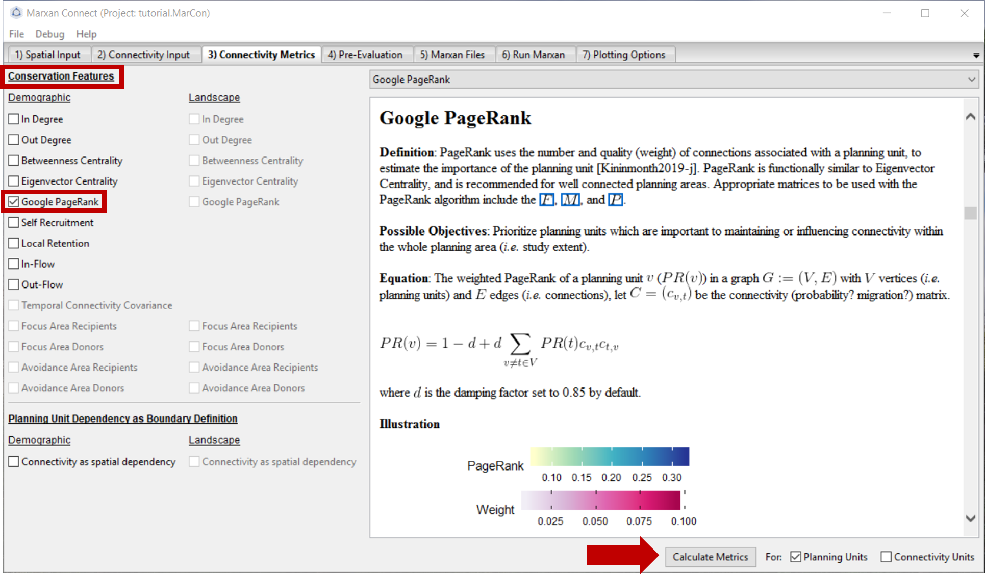
Figure 5: Connectivity Metrics Tab .
Once you have selected a demographic conservation feature press Calculate Metrics. A pop-up window should appear stating that the metric has been calculated successfully. Next, proceed to the Pre-Evaluation tab.
Pre-Evaluation
This page allows you to evaluate the metrics created in the Connectivity Metrics tab in more detail. It also allows you to choose how you would like to transform the continuous connectivity metrics into conservation features for further analysis. To discretize the continuous metric, we’ve used the Quartile option and set the median of the continuous metric Google PageRank as the lower threshold (Make discrete feature from minimum threshold:) and the maximum value as the upper threshold (Make discrete feature to maximum threshold:). These thresholds can be informed by relevant ecological literature, or through trial and error to find a balance between conservation outcomes and cost. Once you have established the parameters of your desired metric, press Create New Feature.
When this is complete, your new discrete feature should appear under Connectivity-based Conservation Feature Available for Export.
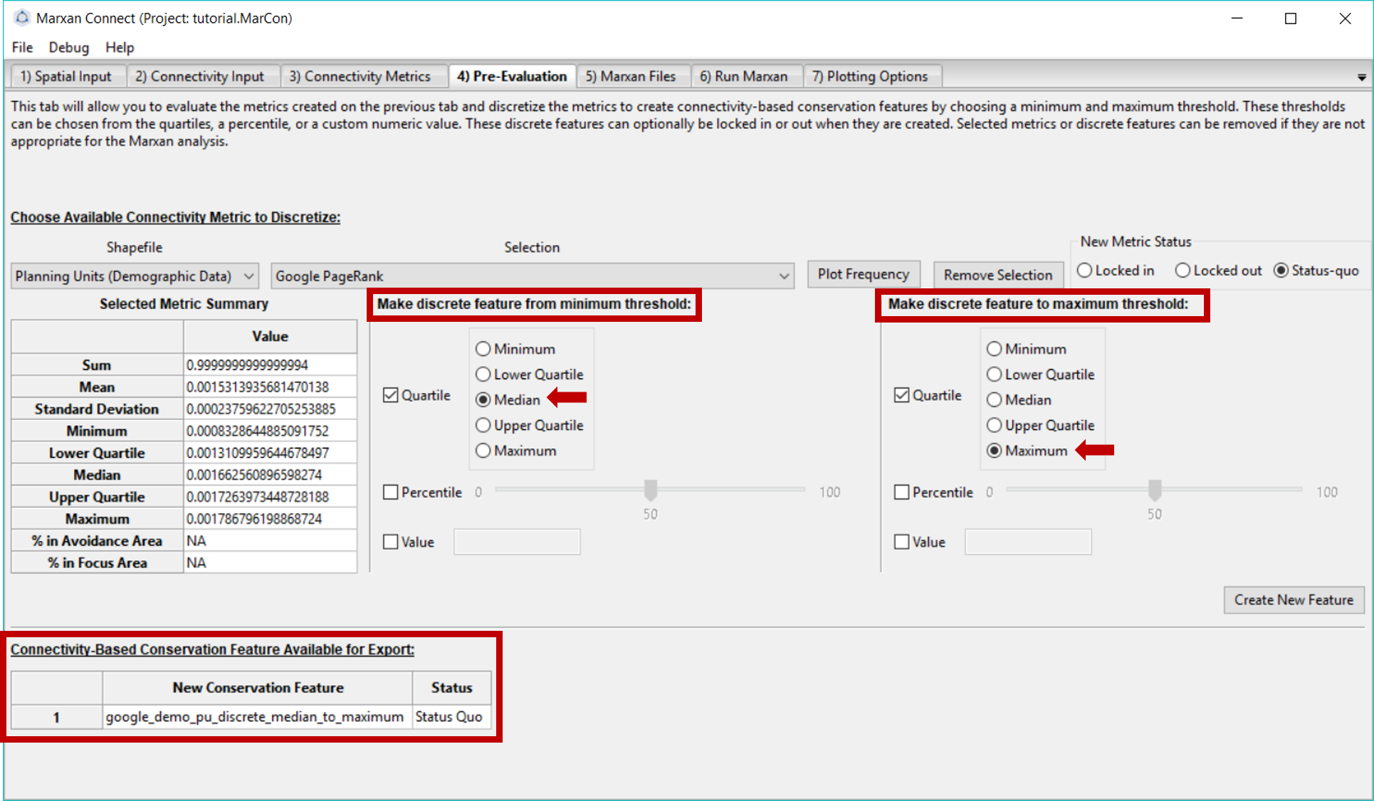
Figure 6: Pre-Evaluation tab .
Now we are ready to move to the Marxan Files tab.
Marxan Files
Here, we add our new connectivity metric features to our Marxan input files. In this example, we’ve chosen to append the new connectivity based conservation features to the existing Marxan files by selecting Append under the Metrics option box. Ensure your original puvspr.dat and spec.dat files are listed by the Original .. Feature File options. You can then name the new, appended files in the New … Conservation Feature File tabs. If you choose the same filename for the new files as the original files, the original files will be overwritten.
In this tab, you will also set a target for each connectivity based conservation feature. This can be done by setting a proportion (e.g. 10% of the entire feature) or a target (e.g. number of total whales - if your puvspr file contains amounts). However, for a connectivity feature this will be the number of planning units that contain the discrete feature. The Customize Conservation Feature File button allows you to customize the new spec.dat before exporting (Note: custom edits will be lost if changes are made in previous tabs).
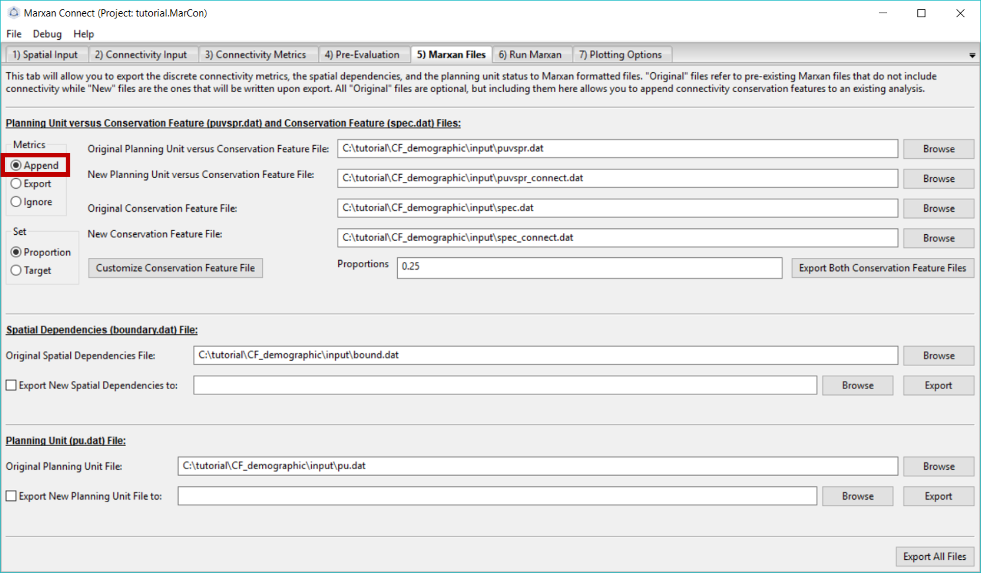
Figure 7: Marxan Files tab .
Once the files are named, press Export Both Conservation Features Files. A pop-up window should appear stating that the export was successful. You should now see two new appended files in your Marxan database input folder.
Let’s examine the appended files that were created. Locate the spec_connect.dat and puvspr_connect.dat files (or whatever filenames you have chosen) in your Marxan directory. They should resemble the tables in the following two sections.
spec_connect.dat
Selecting the third page of the appended spec_connect.dat file, you will find an additional row (21 in this example) with the target for this new connectivity based conservation feature.
spec <- read.csv("tutorial/CF_demographic/input/spec_connect.dat")
datatable(spec,rownames = FALSE, options = list(searching = FALSE))puvspr_connect.dat
The table shown here is a trimmed version showing the first 30 rows as an example of the type of data in the puvspr_connect.dat file. The original dataset has 1627 entries.
Selecting the third page of the appended file, you will find additional rows (corresponding to our new conservation feature, which is ‘species 21’ in this example) with the amount of this feature in each planning unit (For our connectivity based features, this will always be 1).
puvspr <- read.csv("tutorial/CF_demographic/input/puvspr_connect.dat")
datatable(puvspr[1:30,],rownames = FALSE, options = list(searching = FALSE))Now that the necessary connectivity files have been created, We are ready to run Marxan Connect. Proceed to the Run Marxan tab.
Run Marxan
On this tab, we will run Marxan via Marxan Connect. Marxan Connect allows users to generate a Marxan input file (i.e. input.dat) from a Default template or a user defined template. Users should set their commonly used Marxan parameters (e.g. Repeat Runs, Scenario Name), choose whether to use the Original (i.e. without connectivity) or New (i.e. with connectivity) Conservation Features (i.e. puvspr.dat and spec.dat), Spatial Dependencies (i.e. bound.dat), or Planning Unit status files (i.e. pu.dat). In this example since we have only modified the conservation features we will select New for those, but Original for the other files. Using spatial dependencies requires two more options Spatial Dependencies Type and the Connectivity Strength Modifier (or Boundary Length Modifier). In this case, the connectivity matrix is Symmetrical and a Boundary Length Modifier of 10 provided a reasonable balance between conservation outcomes and cost. To generate a new Marxan input file from the template and selected options, click on the Generate New Input File From Template. You can view or customize this file further by clicking on the Customize button. Please see the traditional Marxan documentation for more information
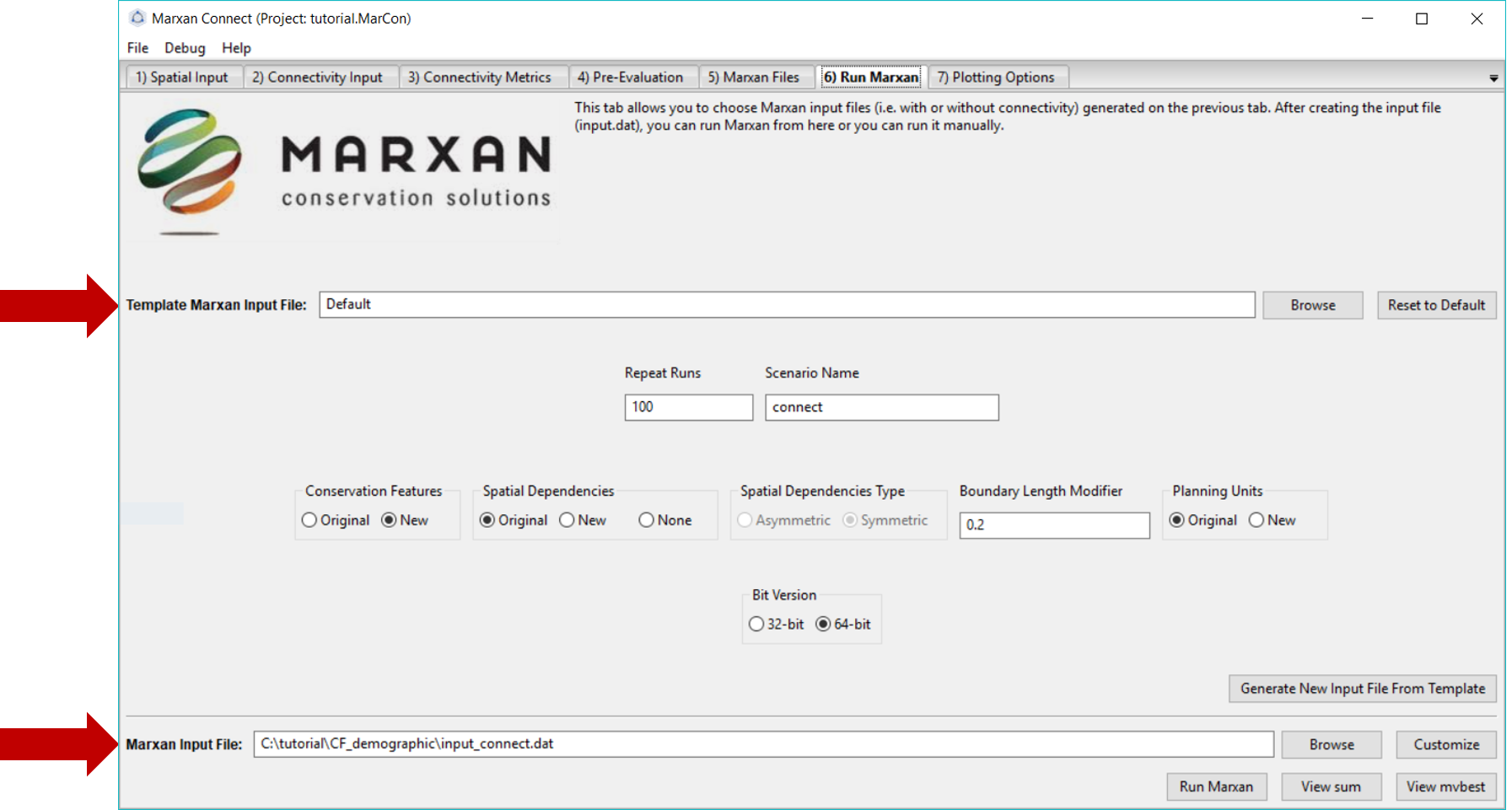
Figure 8: Marxan Analysis tab .
To run Marxan, press the Run Marxan button in the bottom right corner of this tab.
Running Marxan with the connectivity conservation features results in the following Marxan solution:
# planning units with output
output <- read.csv("tutorial/CF_demographic/output/pu_connect.csv") %>%
mutate(geometry=st_as_sfc(geometry,"+proj=longlat +datum=WGS84"),
best_solution = as.logical(best_solution)) %>%
st_as_sf()map <- leaflet(output) %>%
addTiles()
groups <- c("best_solution","select_freq")
for(i in groups){
z <- unlist(data.frame(output)[i])
if(is.numeric(z)){
pal <- colorBin("YlOrRd", domain = z)
}else{
pal <- colorFactor("YlOrRd", domain = z)
}
map = map %>%
addPolygons(fillColor = ~pal(z),
fillOpacity = 0.6,
weight=0.5,
color="white",
group=i,
label = as.character(z)) %>%
addLegend(pal = pal,
values = z,
title = i,
group = i,
position="bottomleft")
}
map <- map %>%
addLayersControl(overlayGroups = groups,
options = layersControlOptions(collapsed = FALSE))
for(i in groups){
map <- map %>% hideGroup(i)
}
map %>%
showGroup("select_freq")Here is the output of our example with no connectivity for comparison.
# planning units with output
output <- read.csv("tutorial/CF_demographic/output/pu_no_connect.csv") %>%
mutate(geometry=st_as_sfc(geometry,"+proj=longlat +datum=WGS84"),
best_solution = as.logical(best_solution)) %>%
st_as_sf()map <- leaflet(output) %>%
addTiles()
groups <- c("best_solution","select_freq")
for(i in groups){
z <- unlist(data.frame(output)[i])
if(is.numeric(z)){
pal <- colorBin("YlOrRd", domain = z)
}else{
pal <- colorFactor("YlOrRd", domain = z)
}
map = map %>%
addPolygons(fillColor = ~pal(z),
fillOpacity = 0.6,
weight=0.5,
color="white",
group=i,
label = as.character(z)) %>%
addLegend(pal = pal,
values = z,
title = i,
group = i,
position="bottomleft")
}
map <- map %>%
addLayersControl(overlayGroups = groups,
options = layersControlOptions(collapsed = FALSE))
for(i in groups){
map <- map %>% hideGroup(i)
}
map %>%
showGroup("select_freq")Plotting Options
Here the users can plot up to two layers of input or output data on a built-in basemap (provided by the basemap package). The tab allows users to choose a few basic color, transparency, and legend positioning options, as well as export the output data in various formats to provide further plotting or analysis options.
References
Beger, Maria, Jennifer McGowan, Eric A Treml, Alison L Green, Alan T White, Nicholas H Wolff, Carissa J Klein, Peter J Mumby, and Hugh P Possingham. 2015. “Integrating Regional Conservation Priorities for Multiple Objectives into National Policy.” Nat. Commun. 6 (September). nature.com: 8208.
Beger, Maria, Kimberly A Selkoe, Eric Treml, Paul H Barber, Sophie von der Heyden, Eric D Crandall, Robert J Toonen, and Cynthia Riginos. 2014. “Evolving Coral Reef Conservation with Genetic Information.” Bull. Mar. Sci. 90 (1). University of Miami - Rosenstiel School of Marine; Atmospheric Science: 159–85.